Product Design
BrokerPocket Public Site
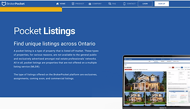
BrokerPocket is a digital platform designed specifically for the progressive real estate agent, brokerage and real estate board looking to access off-market listings. The digital platform helps users search for private housing and commercial listings that cannot be found in the public listing service in Canada, specialized for privacy and network isolation.
Company
BrokerPocket
Time and Team
3 months, 1 PM and 1 designer
Role
UX Design, Visual Design, Animation, Interaction Design, Prototyping, Design System

Introduction
My job was to not only redesign, but completely rethink the old legacy public website and build a new product that empowers users with new capabilities. As their product designer, it is important to acknowledge that our users' average age is 50+, so I have to help users access the content easier and ensure the website is easy to follow step-by-step, so anyone can connect and sign up to our platform. Simultaneously, improve the UI and the padding of the older website. The old legacy website was more educational and view-only data to explain Pocket Listings, which failed to provide accurate background information about the company and a good user experience.
Challenges
The old legacy website was more of an education and view-only data info to explain what Pocket Listings are that failed to provide accurate background information of the company and good user experience.

1. Lack of Company Content
2. Lack of Call to Action
3. Outdated Visuals
Users cannot find the purpose of the website, no introduction of the company was found.
There are no call to actions other than one sign up button and users cannot learn more about the platform features.
There are no call to actions other than one sign up button and users cannot learn more about the platform features.
An example of misleading usage in UX from the old legacy website

This is one example of the wrong deliverables of messages happening in our older version of the website.
When looking at this circular graph, all our audience's attention will be focused on the circle with the highest opacity instead of the sizes of the circles, which has the original purpose of displaying that our net worth has grown from 23.6 to 212.5 billion dollars. But due to the opacity of the circles, our users will unintentionally focus on the smaller circle as it's the easiest to be seen in the graph.
To build up the User Research
Before I joined BrokerPocket, there were limited user research resources done by the previous designers. Therefore, I decided to conduct user research on three main parties of our users: Real Estate Agents, Brokerage Representatives and Real Estate Board members to understand their approach towards our app and insights into the industry.
This way is the best approach to knowing:
-
What are their values?
-
What rules and activities do they have to play along?
-
What are the goals they have in common and differ?
-
And most importantly: What are their needs and expectation from us?
Card Sorting Guidelines
- Turquoise cards represents Real Estate Agents
- Purple cards represent Brokerage
- Red cards represent Real Estate Board members
- Blue cards represent all the stakeholders
Values
Real Estate Agents
Accountablity.
Aim for commission.
Career driven.
Professionalism.
Brokerages
Prosperity.
Strategic.
Profitability.
Accountability.
Real Estate Board
Integrity.
Honesty.
Ethical.
Fairness.
Balance.
Rules and Activities
Licenced needed.
Gain profit from commissions.
Gone through exams to be one.
Meeting and Staging - showing homes to clients.
Scheduling appraisals and inspections as a mediator.
Have power to oversee agents and brokers for the purpose to protect the public.
Analyze Data and Market trends.
Gather a team of brokers.
Process sales transactions.
Monitored by the board.
Non Profit Corporation mandated through By-laws elected board of directors and government.
Provide ethical practices.
Make policy changes
and updates.
Advocate for solving problems.
Personal Goals
Staging accountable in front of their clients.
Complete Sales.
Follow up on leads.
Closing listings per quarter.
Focus on leading indicators (activities they can control).
Keep a good track record in their reputation.
Complete a competition analysis with positive outcome.
Actively have collaboration with stakeholders involve in the field.
Maintain the order, rules and balance in the real estate industries.
Provide education, membership, housing resource to agents, brokerage and even the general public.
Monitor related affiliations.
Common Goals
Get off-market listings through a secured digital platform.
Ability to network with other real estate agents, brokerage, real estate board.
Hope to understand what reputation does BrokerPocket provides through
E.g. Clients connections and online presence.
Get sufficient data to help them grow in the off-market listings postings.
Fulfill endorsement from approved association.
Needs and Expectations
Accurate and up-to-date information: Users expect the website to provide accurate and up-to-date information about the properties listed, including photos, descriptions, amenities, and other details.
Increased Users engagement in the Ad sales of BrokerPocket.
Inner system for them to contact within the listing sales.
Accurate data compositions of the users flow on their listing visits.
Provide an ethical and fair platform that does not involve in any legal matter
Provide a choice for the general public to choose from when privacy valued first before the public listings.

Constraints can be challenging, but I found creative solutions to overcome them.
After conducting card sorting exercises to identify common goals, we were inspired to showcase the full capabilities of the BrokerPocket app. However, due to time constraints, I was unable to create detailed low-fidelity wireframes and sketches. Despite being responsible for all aspects of the design process including prototyping, mockup creation, design system development, and animations - including creating an animated video - I had no prior experience in video editing. Unfortunately, due to limited resources, our company could not afford to hire a dedicated video editor. In spite of these challenges, I designed and created a video using Adobe Premiere Pro to demonstrate the interaction within the BrokerPocket platform. Although the video may not meet professional standards, it allowed me to make significant progress with the app redesign while demonstrating my core value of being committed to learning new skills.
The Video features the iconic Mississauga Absolute World building, BrokerPocket's app flows and mockups.
The Design Phase
In this stage, we created high-fidelity mobile and desktop mockups of the website, incorporating the feedback received from my project manager. The mockups were designed to reflect the company's brand identity and provide a visually appealing and engaging user experience.
Home Page
In the first phase of the home page redesign, we had a hard time to find the right fit for the hero image. As we want to use an image that combines the technology aspect and the real estate aspect to show the first impression of the website. Simultaneously, delivers the message the platform is limited to Agents, Brokerages and Real Estate Board.
So I chose a luxury house with snow and a blue theme background, to portray houses in Canada. Alongside with an animated counter of switching the three target users around.
The Home Page features some of the bigger brands like Century 21 and RECAR that has a good relationship with us to build more trust on users that are not as familiar to our company but familiar with the bigger names. Also, it includes the difference we make with other platforms and the main two account types that can be signed up in our BrokerPocket Platform for agents and brokerages. The animated video I made is featured in the home page as well.
Mobile Design:
At the start of the mobile design, I decided to create a company introduction animation, where it flows smoothly to achieve a balance between animations and accessibility design.
Final Design:
After reviewing the Home Page design with my Product Manager for numerous times, I made specific adjustments towards the hero image, although the first version hero image establish the luxury and the theme of BrokerPocket, it hard for our users to relate. So given that, 63% of our users are from brokerages located in Mississauga, I decided to use a hero image that features Mississauga in dawn to grab our users' attention with the sense of belonging and familiarity.
I also added an arrow button for users to click that brings the page's extension to clearly state there are more information down the page, to introduce accessibility designs with some changes in the spacing as well to make the overall length of the home page shorter and more accessible. Sadly due to time constraints, our developers weren't able to code the animated counter, so I have to replace it with another title instead.
Usability Testing
I conducted a series of usability tests with users to see how they interacted with the site and identify the pain points. Through constant communication with the developers, we have solved most of the bugs and established a clean, modern layout with clear and intuitive navigation. The homepage featured prominent calls to action, making it easy for users to get started. The site also included a search function and a series of filters to help users find the information they needed quickly and easily.
The Final Product
The final design for BrokerPocket's website successfully achieved their objectives and exceeded expectations. The outcome of our collaboration resulted in the following key outcomes:
-
Enhanced User Experience: The new website design provided a user-friendly experience, allowing visitors to easily navigate through the site, access information, and engage with the desired services. Clear call-to-action elements on sign-ups and request a demo were strategically placed to encourage user interaction and conversion.
-
Improved Brand Perception: The visually appealing design and cohesive branding elements helped elevate BrokerPocket's brand perception in the market. The design reflected their professionalism, expertise, and commitment to agents satisfaction.
-
Increased User Engagement: Through the integration of engaging content and intuitive design elements, the website witnessed a significant increase in user engagement. Visitors spent more time exploring the site, leading to improved conversion rates and increased customer acquisition.
-
Mobile Responsiveness: The responsive design ensured a seamless user experience across various devices, allowing visitors to access the website on-the-go. This resulted in broader reach and improved accessibility for older agents.
Conclusion: The BrokerPocket website design project was a resounding success, thanks to the collaborative efforts of our team and the valuable input from the client. The final design achieved the desired objectives of enhancing user experience, improving brand perception, increasing user engagement, and ensuring mobile responsiveness. We are proud to have played a part in BrokerPocket's online transformation and look forward to continued success in their digital endeavors.
Next Project
LocalBuys